Nowadays, we are exposed to a large amount of information via advertising and social medias. Images are the best tool to draw our attention because they are interpreted more quickly than videos and written texts. This is well understood by businesses wishing to be noticed.
But, how to make sure our image will stand out and will speak to our target clientele? What kind of element will highlight our rendering and generate interest from our prospects? The answer is: Liveliness!
Bring your image to life with the right staging
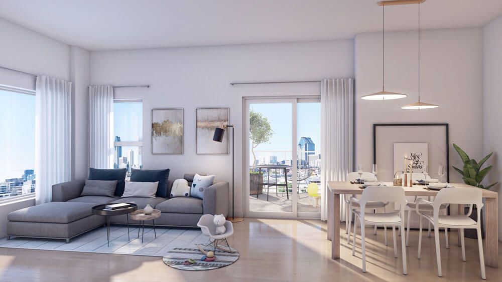
A « traditional » real estate image usually highlights the windows, balcony, views, design and other essential elements of a project. But what more can we do to improve the realism of a 3D rendering? The devil is in the details! Many little things can help create a space that looks actually inhabited, and the staging is one of them.

The persona and the staging
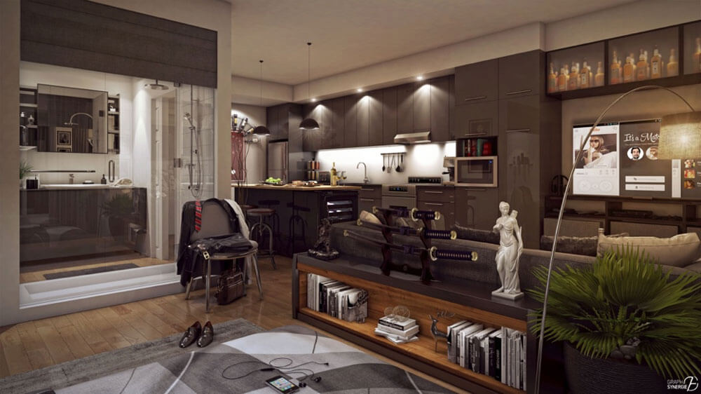
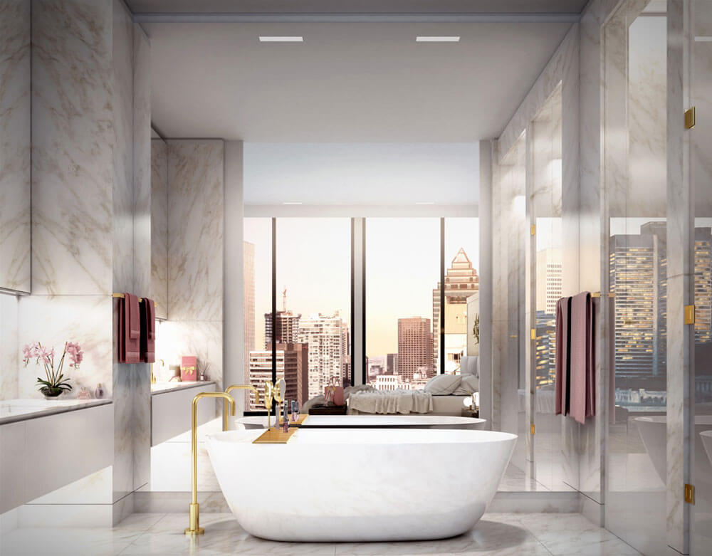
It’s crucial to bring a 3D environment to life with our target clientele in mind, this way a buyer can easily project himself living in the space. Defining the persona is key to be able to master the main features of a target market by adding the right element to the staging. For example, the accessories selection will be different for a man than a woman, for the millennial generation than a senior, etc.

In the image above, the furniture and accessories selection is consistent knowing the goal is to target the following clientele: a young and single businessman.

In this picture, gold accents paired with tones of pink, white and beige, are typically feminine.
Targeting a specific clientele before starting a promotional image is critical. To sell (or rent) a condo, house, commercial space, is to sell a lifestyle! Being constantly on the lookout for the details is what makes the difference between a simple image and a 3D rendering making the targeted clientele wanting to live happily in the space.

