Whether on a website, in a promotional brochure or even in an email message, typography styles and varieties can be found everywhere. As a result, it is crucial not to underestimate their impact in making your choice and using them. Let’s have a look together at the essentials of typography where you will learn how to set the tone for your text and make the reader’s job easier.
Families
Did you know that there are several font families? Each of them has its own characteristics:

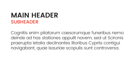
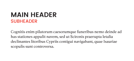
The two best known and most used families are those called “Serif” and “Sans Serif.” Fonts with “Serif” are more common for long texts because they make reading easier. The eye is guided instinctively by the lines formed by the serifs.
The “Sans Serif” fonts are ideal when rapid reading is required from a greater distance. For example, these are regularly used for road signs and other information banners.
Fun fact
“Frutiger,” a “Sans Serif” font, was created specifically for all signage at Charles de Gaulle Airport in Paris. The challenge then was to produce a font which would be legible thus enabling travellers to quickly get their bearings.

Diversity
It is usually recommended to use one single typeface in a given text. However, for headers and subheaders, it is important to vary the format (bold, italics, colour, etc.). For example, the popular “Arial” font can be used in various ways: with the headers bolded and capitalized, subtitles only in capitals and the text body in regular format…. This way, the text will be more rhythmic!

If, however, you decide to include more than a single font in your text, it is recommended that you use a “Sans Serif” font and a second one with “Serif.” Why? Because it is much easier and faster to harmonize two fonts which do not come from the same family. In fact, the difference between the fonts will then be more obvious and the layout more simple to create.

Spaces
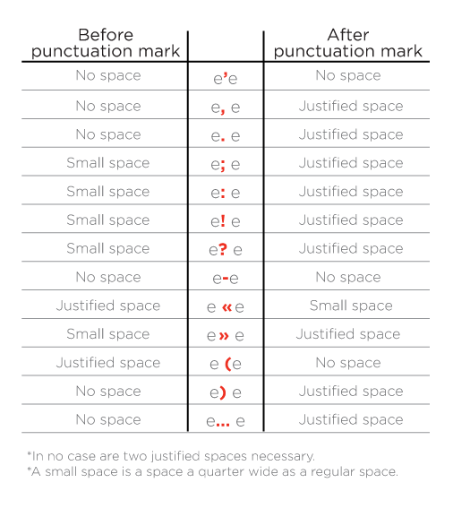
Spaces also play an important part in typography. Rules must be followed in order to create uniformity within a given text, whatever its intended purpose.

One last thing: typography is the art of making reading smooth and visually attractive. It is an art mastered by graphic artists but it can also be easily understood by the general public. It’s all a matter of instinct. Don’t be afraid to try new fonts and to use a variety of formatting techniques!

