Once upon a time there was a company climbing the ladder to become one of the most important office buildings owners in the province of Quebec. Having kept a low profile for quite a few years despite the considerable size of its real estate portfolio of nearly 20 million square feet of space, this company dreamed of a breath of fresh air for the celebration of its 17 th anniversary.
Mach
Case study
Rebranding for renewal, now that’s a tall order.
You must first understand who and where you are, and then where you want to go. After much reflection, many meetings and a lot of soul searching, the Mach Group has finally determined its identity!
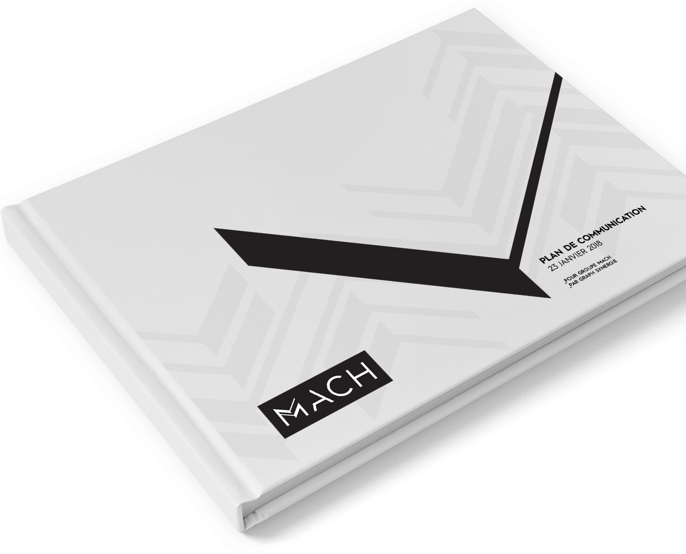
Realizing that their logo and their communication strategies did not match their vision, the creative team of Graph Synergie took matters in hand.
So it was with confidence that the Mach Group boldly advanced to become Mach.
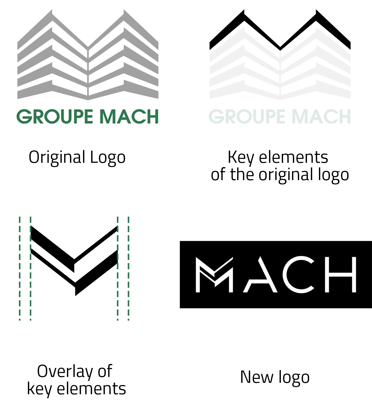
The evolution of
a remastered logo
Eager to preserve the spirit of the original Group logo and to bridge the gap between a strong past and the present reality, this new concept still points to the multi-storey building represented in the original design, but now in more subtle fashion.
Dedicated to quality: that’s one of the features that sets this brand apart.
The new logo was, in fact, styled to have somewhat of a museum look.

Art is alive
and well
in the
Mach
brand.
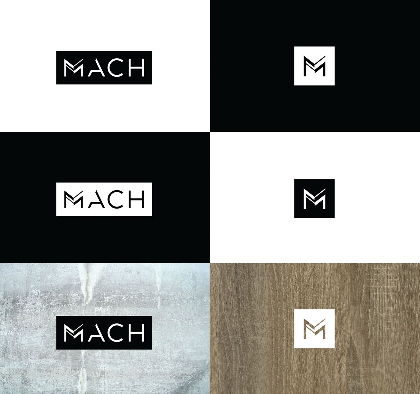
The new logo
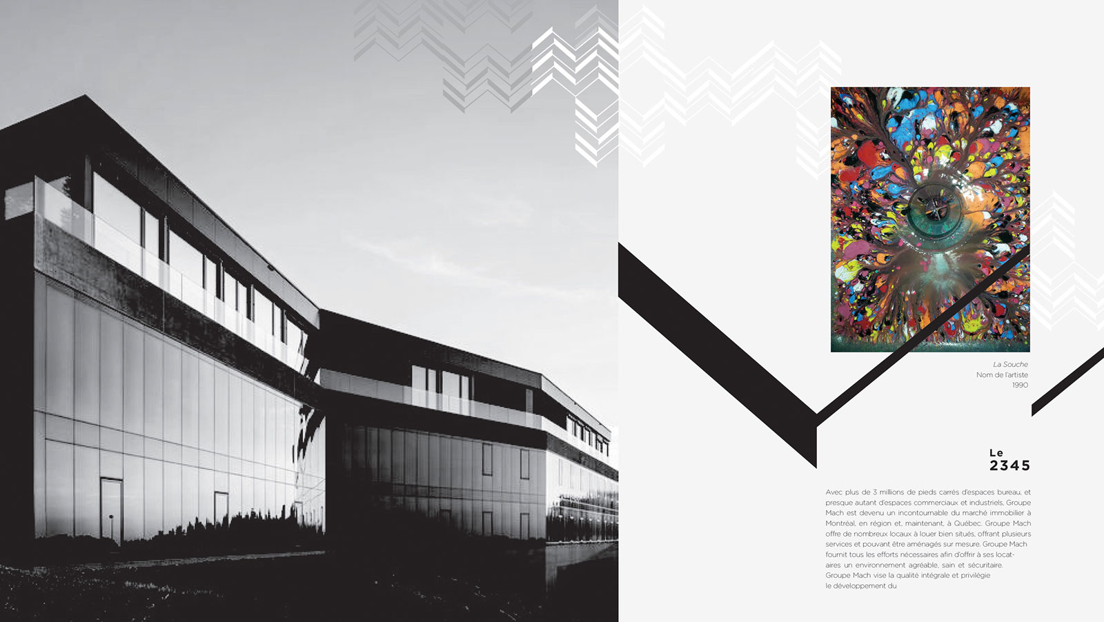
Two levels were chosen to form the central span in the letter M, the star letter in the name which deserves to be even more accentuated and given more prominent display.
Our designers opted for a monochrome presentation wanting to facilitate integration, but, at the same time, to focus on the power of neutrality present in black and white. This vote for simplicity underscores the elegance aspect of the logo.
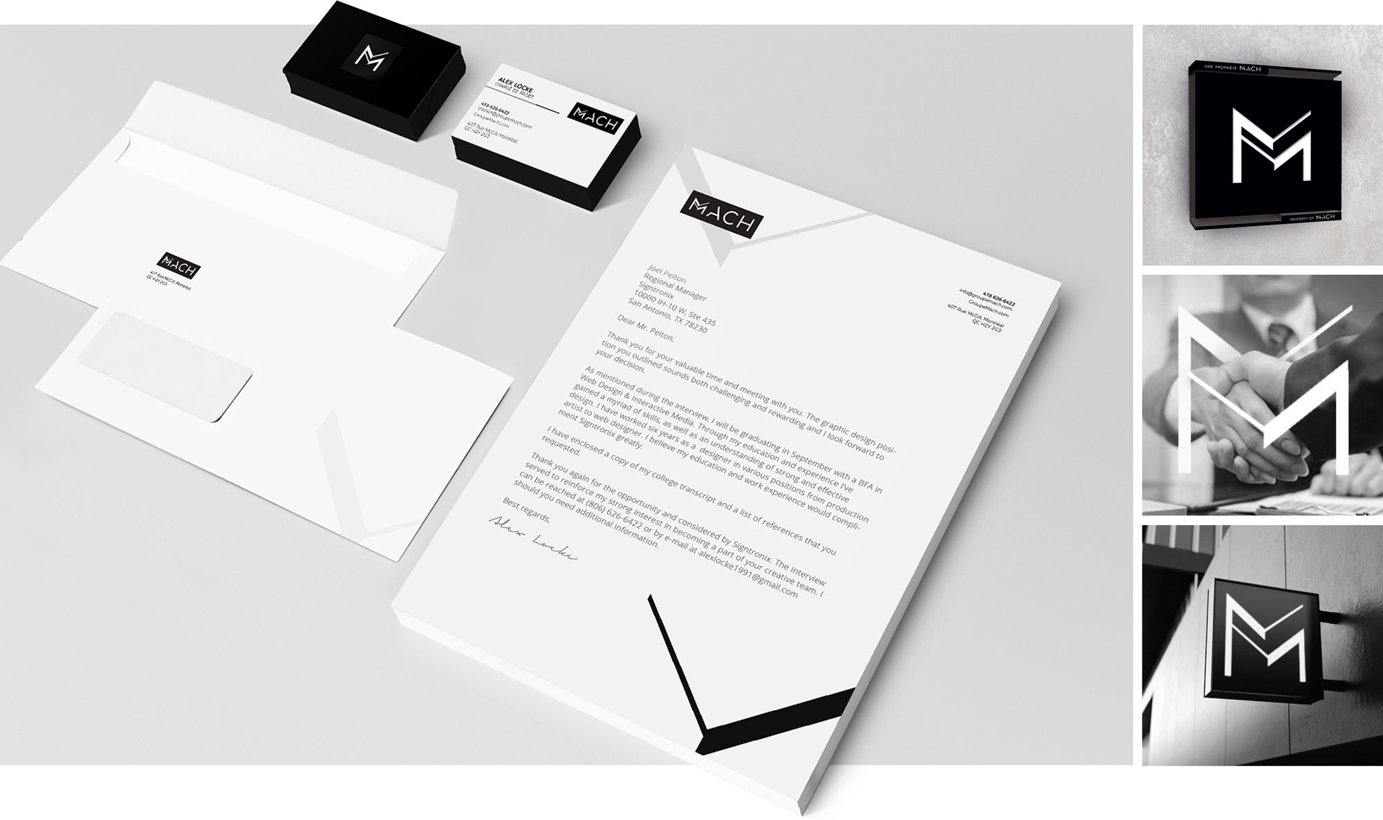
Now there is a company well equipped and bursting with ambition, ready to carry on with its extraordinary growth!
Would you like to see other projects?
Portfolio
